Processing Ajax...

Title

Message

Confirm

Confirm

Confirm

Confirm

Are you sure you want to delete this item?

Confirm

Are you sure you want to delete this item?

Confirm

Are you sure?

User Image
Domokun
48 discussion posts
http://img34.imageshack.us/img34/2720/unreadable.png


As you can see in the screenshot, the new glow effect kind of makes the text of the program hard to read. This only occurs when you hover the mouse over a non-active window. Once you actually press the button the window becomes active and the text isn't unreadable anymore.
Aug 5, 2009  • #1
User Image
benway
343 discussion posts
I normally have text turned off, but once I turned it on, I see the same thing. (turned it back off :|)
Aug 5, 2009  • #2
John L. Galt's profile on WallpaperFusion.com
I have text turned on and the DF taskbar at 95% transparency (to make it look and feel more like the W7 taskbar, since it is not 100% transparent either). My text is already fuzzy to begin with, and gets worse with the glow. However, I always know what is there, so....to me this is a very minor annoyance - I prefer having the glow effect and transparency effect and will live with blurry fonts.

However, it is a good thing that you reported it.
I am I.
Aug 5, 2009  • #3
Jon Tackabury (BFS)'s profile on WallpaperFusion.com
What does this taskbar item look like on the Windows taskbar? Would you be able to provide a screenshot of that as well?
Aug 10, 2009  • #4
User Image
Domokun
48 discussion posts
I actually don't have text on my Windows 7 taskbar, so it's just an icon:

http://img3.imageshack.us/img3/1697/wlm.png
Aug 10, 2009  • #5
Jon Tackabury (BFS)'s profile on WallpaperFusion.com
The reason I ask is that I have found some of the items impossible to read as well on the Windows taskbar. :( I'll see what I can do about cleaning up the text anti-aliasing to make it a bit more readable for the next beta.
Aug 10, 2009  • #6
Jon Tackabury (BFS)'s profile on WallpaperFusion.com
This should be fixed in the upcoming Beta 10. Thanks!
Aug 12, 2009  • #7
John L. Galt's profile on WallpaperFusion.com
It also depends upon the transparency level and the background behind the toolbar.

I had a lighter-colored background and it was harder to read, but when I switch to a darker color background, it is easier to read. If I had the DF toolbar set to auto hide, then the background is usually another windows that is full screen, and more often than not that means that the background is a much lighter background than if it is not auto hiding, and thus showing my desktop wall paper through)which is a mixture of grays and dark grays).
I am I.
Aug 12, 2009  • #8
Jon Tackabury (BFS)'s profile on WallpaperFusion.com
Can you give the new Beta 10 a try and let me know if it is any better for you? If it isn't can you let me know exactly what window style settings you are using (color, translucency... etc). Thanks!
Aug 13, 2009  • #9
John L. Galt's profile on WallpaperFusion.com
It works for me right now with a dark background and auto-hide disabled. I'll try with auto-hide enabled, although, tbh, I rarely have to look at the wording on my taskbar as I usually look at the icon and know what I am looking for / at.

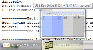
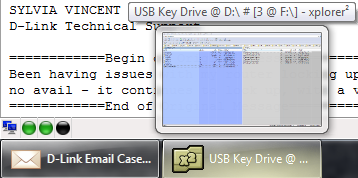
OK, #1: My file mananger, xplorer^2 in the background, with a baby blue pane shading, DF TB AH enabled, xplorer^2 button highlighted (glow).

#2: Thunderbird in teh background, White background, DF TB AH enabled, xplorer^2 button highlighted (glow).

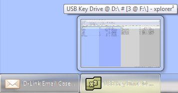
#3: Wallpaper in the background, normal DF TB AH disabled, nothing highlighted (although it looks like the Thunderbird icon is highlighted a bit).

#4: Wallpaper in the background, normal DF TB AH disabled, xplorer^2 button highlighted (glow).
I am I.
• Attachment: DF TB highlight 1.PNG [32,142 bytes]
DF TB highlight 1.PNG
• Attachment: DF TB highlight 2.PNG [45,421 bytes]
DF TB highlight 2.PNG
• Attachment: DF TB highlight 3.PNG [22,404 bytes]
DF TB highlight 3.PNG
• Attachment: DF TB highlight 4.PNG [47,613 bytes]
DF TB highlight 4.PNG
Aug 15, 2009  • #10
Jon Tackabury (BFS)'s profile on WallpaperFusion.com
The light coloured taskbar definitely looks worse, but still not too horrible. :) Hopefully in the future I'll be able to find a way to do the text AA a better way, that looks more native. This is as good as it gets for version 3.1 though... unfortunately.
Aug 17, 2009  • #11
John L. Galt's profile on WallpaperFusion.com
No worries - we know you're on it....
I am I.
Aug 19, 2009  • #12
Subscribe to this discussion topic using RSS
Was this helpful?  Login to Vote(-)  Login to Vote(-)