When you first enable the 2nd taskbar it comes up using the classic large buttons. If you then go into tkasbar and start menu properties and select use small icons, it'l switch to the new square buttons.
Thanks for a great product.
Sorry, I'm not sure what you mean. DisplayFusion should share the same icon size as the Windows 7 taskbar - is it not? Changing the Windows setting should update DisplayFusion as well.
Yeha, when it was first installed it had the large application buttons as if you had selected the never combine option in the windows taskbar properties.

rog1039
13 discussion posts
I've noticed something that sounds like what the OP was talking about. I use the "small icons" option in Windows 7. In small icon mode, the buttons on the DF taskbars are not square, but elongated horizontally. On the Windows taskbar, the buttons are square ( or if not completely square, more square the DF buttons ). However, in large button mode, the DF and W7 taskbar buttons appear to be sized exactly the same. It looks like the width of the taskbar buttons in DF do not shrink as much as they should in "small icon" mode.
I've attached two pictures. The first is with "small icons" checked in the taskbar properties screen of Windows. The second picture is with the "small icons" option unchecked.
Also, are there plans to support proper coloring of hovered icons on the DF taskbars like Windows 7 taskbars? I've attached another two more screenshots with that difference.
And I didn't even notice this before, but since I was looking at these button differences, I noticed the active window button state is different. It appears on the DF taskbar the active window button is opaque or very nearly so compared to the Windows 7 taskbar. On second glance, maybe the Windows7 taskbar is just slightly brighter and more translucent? I've attached screens of the differences so you can judge.
Thanks,
Paul

activewindowbuttondf2.png

activewindowbuttonw72.png

buttoncolordf.png

buttoncolorw7.png

largeiconsdf.PNG

smalliconsdf.PNG

rog1039
13 discussion posts
I almost didn't even mention the colors since it is so nitpicky, but then I thought if you finish all the other more important features then the colors could be worth tackling. The colours are really good and this is without question the most W7 like taskbar available. I didn't even notice it until I started taking screenshots for the button width situation but thought since I did I could let you know so you could add it to the bottom of your todo list if you felt it was worth it. The color issue is pretty much on the bottom of my care-about list compared to other things you are working.
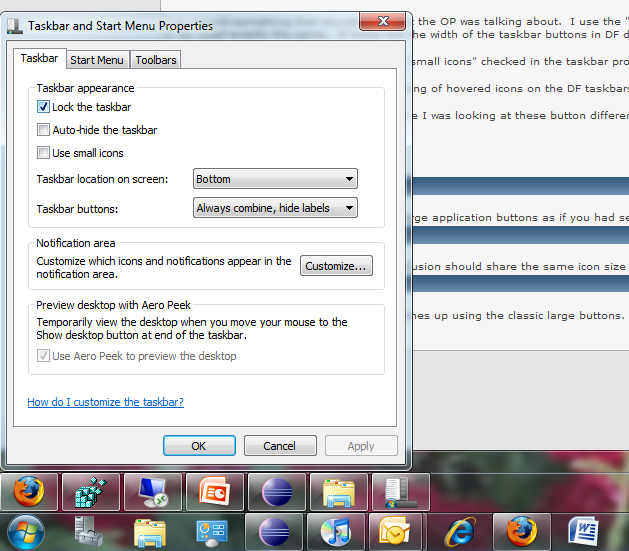
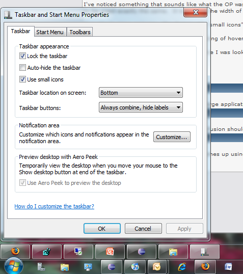
With that said, the one issue I do care about is the size of the small-icons buttons on DF taskbars. I just saw the advanced setting about taskbars on all monitors and think this screenshots illustrates the problem a little better. Basically, in small icon mode (without any labels - I never have any text showing, just icons), the DF buttons are the same height as W7 buttons but much wider. About combine items, I always have W7 set to always combine and hide labels.
So I've attached two screenshots. The first is large buttons which looks exactly like I believe it is supposed to. It looks like DF and W7 buttons are the exact same height and width. So your implementation of the large button option is perfect.
The second screenshot is of the small icons option. Here we can see the DF and W7 taskbar buttons are the same height, but it looks like the DF buttons are wider. You can see the W7 eclipse button right below the DF powerpoint button and you can see how the DF powerpoint button is much wider than the eclipse W7 button below it. The DF buttons look 60 pixels wide, give or take a few pixels whereas W7 buttons are 42 pixels wide, give or take a few pixels. The heights of DF and W7 buttons are pretty much the same, 27 pixels tall as far as I can tell.
As for functionality, the taskbar works just like I would expect, this is more of an aesthetic issue. So I imagine this isn't too high up on the priority list, which is fine. I can think of other more important features to work on too. But when you have the time, I would prefer this width situation worked on before the color issue mentioned in the beginning.
I also wanted to say DF is one of my favorite programs and definitely one of the best software purchases I have made. You've done a great job so far.
Thanks,
Paul

buttonsizelarge.PNG

buttonsizesmall.PNG

rog1039
13 discussion posts
You're welcome and thank you for the quick response!