PGomersall
229 discussion posts
Jon,
First thanks for access to the beta.
OS: W7 x64, Office 2010 plus a bunch of Open Source admin management tools & MS RSAT for W7
1) Have you a reason to not enable task-bar buttons by default.
2) It was not initially obvious that I have to add buttons after I choose to enable them; I thought there was a bug and that they were not working. I think this comes from been an UltraMon user and thinking that there was a default set. Maybe a default set would be useful
3) When you add a button the dialog should choose the default image for the choice; currently when you click "add" the image always defaults to the first in the list - not the one of same name.
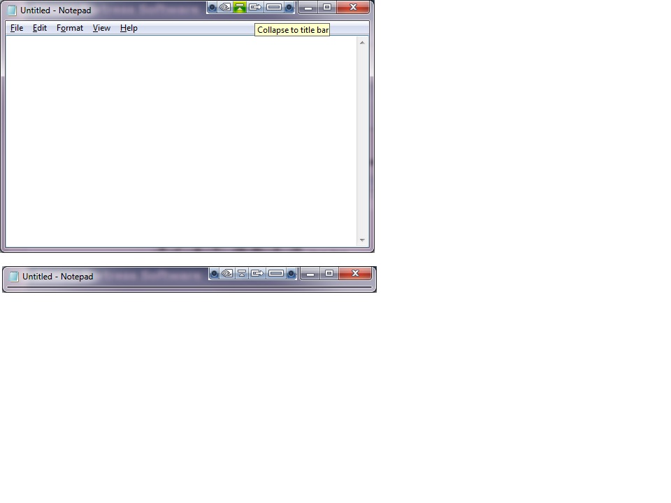
4) What about a collapse to title bar function - I know this exists in Nvidia NView software - but it seems a bit buggy there and maybe not all windows support this ability
I will keep posting as I use the app.
Looks good so far though

sfwrtr
273 discussion posts
Re enabling titlebar buttons by default: Though I like the concept, enabling titlebar buttons by default has disadvantages, namely,
(1) When CPU utilization is high, the buttons don't stick to the window but do mouse tails. Sorry, but this looks amateurish. We want people to go Pro, remember?
(2) Even when CPU utilization is low, the buttons can appear after a noticeable though negligible delay. This is distracting and brings attention to something the user may think is not working, rather than to spiffy features the user really needs to decide they cannot live without (as I have myself concluded).
(3) Putting up UI additions that are not expected will scare some people. If there's something that even hints of malware, as a free download you've probably lost the sale.
I am speaking as a programmer who has been working on mainframe and workstation software since 1984 (first as tech support, then a programmer in 1989). I helped write a DOS product, and later wrote Windows product that we launched in 1985 and which is still marketed. This is a product that employs salesmen. Admittedly, my audience is less tech-savvy and more skittish than most, but I've come to the conclusion that when you provide enhancements, you must let users turn them on to try them only once they understand what they are.
I think titlebar buttons are a great idea, but because of system limitations I think you should consider including a warning on the configuration tab that states something like, "Titlebar buttons are not part of the caption bar. Occasionally, the buttons may appear to lag behind or pop onto the window. These are Windows limitations."
Take it or leave it. From my perspective, I see tech support headaches miles away. I vote to leave the buttons disabled by default.

I do not use Titlebar buttons at all - so I disable them. I use middle clicking to move from monitor to monitor, and enable moving of maximized windows - and presto, I middle click anywhere in the title bar of *any* window (of all the apps I have installed thus far) and it moves to the opposite monitor.
But, I feel I am probably in the minority here. I suspect that most, in fact, *do* use the titlebar buttons....
If you enable them, then I will do as I used to in UM - manually disable them.
(This reply was being typed as Software Writer was also typing - so here are my updated comments reflecting that)
While I agree that Jon wants as much business as possible, I also have to say that the product sells itself - a lot. Also, the more technical folks want bells and whistles turned off, for various reasons - but to the same sort of crowd that you were dealing with, it is exactly the bells and whistles that garner most of their attention. Yes, users need to know how to turn them off and on for themselves - but initially, when looking at the product OOB, until they enable them, they won't see them - and some users *never* go into the settings and make adjustments and thus never see some features that are initially disabled.
Of course, this is a double-edged sword - if you enable *everything* then your product's performance lags, and for all the bells and whistles in the world, if it makes the computer slow (and thus the user's productivity decrease) then you lost the very same "Ooooohhh, Aaaaaah!" crowd.
I *DO* wholeheartedly agree with your warning message of some sort - a pop up on the first time that they are enabled (or every time they are enabled, for that matter, with the option to disable the warning) would be nice....
I am I.

PGomersall
229 discussion posts
Freudian slip with the task not title.
I can see everyones points here.
Information is key here and let the user decide.
Re your comment about #2 - you mean default icon for the button, which I concur with.
Jon the feature I mention in 4 is where the whole window collapses to the height of the title bar. See attachment.
Another idea - what about hot key to enable/disable buttons?
Pete

TitleBarFunctions.jpg
+1 for window shade / rollup (#4)
+5 for hotkey enabling / disabling
I am I.