Yesterday, I installed Office 2016 from Office365 and discovered Microsoft has added a new icon in the upper right title bar. There is now a new Ribbon visibility control just left of the minimize icon.
I have been using the DisplayFusion Compatibility Mode to move the DisplayFusion title bar buttons around on several apps. In Office2016 apps, I am able to shift them further to the left using this feature so they are no longer over the Office Ribbon control icon, but now they are so far over, they're interfering with the Title bar and document name when it is long.
There is a nice blank space right below the Office Window buttons that would be a good place to position the DisplayFusion titlebar buttons. In compatibility settings, I've adjusted vertical offset but positive offsets have no effect, and negative offsets take them off the top of the screen.
Is there an invisible limit to how far down the screen the vertical offset can move the DisplayFusion title bar buttons? I've tried positive values to from 10 to 50 with no discernible movement.
Using DisplayFusion Pro 7.3.1 with Beta Version updates enabled.
On a related note, Office 2016 offers colored titlebars, and a dark gray. As a result, the black icons from DisplayFusion no longer have good contrast. Would it be possible to add the ability to reverse the icons from black to white in the compatibility settings so they can have good contrast on apps with dark titlebars? It seems the color of the title bars in Office 2016 operate independently of the global Windows title bar colors. The rest of my applications use the global setting and have a lighter color, providing good contrast for DisplayFusion's titlebar buttons.
Sep 29, 2015 (modified Sep 29, 2015)
•
#1

Here's a screen shot of what Outlook 2016 looks like with the native controls and DisplayFusion's screen controls adjacent. I've added the yellow arrow to show where I'd like to position the DisplayFusion controls, but can't for some reason. In Word and Excel, the space below the native window controls has the user's name and a Share button, so those may need to stay left of the native windows controls.
The first attachment shows the same Outlook window in "dark" theme.
The Outlook titlebar on the second attached image is being displayed in what Microsoft calls "Colorful" theme. Each of the Office 2016 applications shows a titlebar in the color of its icon. Outlook = blue, Word = blue, Excel = Green, Access = Red, PowerPoint = Orange. As you can see, Microsoft has also put more space between their control icons, as well, making the problem a bit more acute. I'm starting to wonder if putting DisplayFusion controls in the upper left might be better, but the anchor point specified in compatibility would have to be the upper left to ensure the icons stayed put when the window is minimized.
• Attachment [protected]: Outlook-DisplayFusion-Dark.png [9,707 bytes]
• Attachment [protected]: Outlook-DisplayFusion.png [11,931 bytes]
Oct 2, 2015 (modified Oct 2, 2015)
•
#3
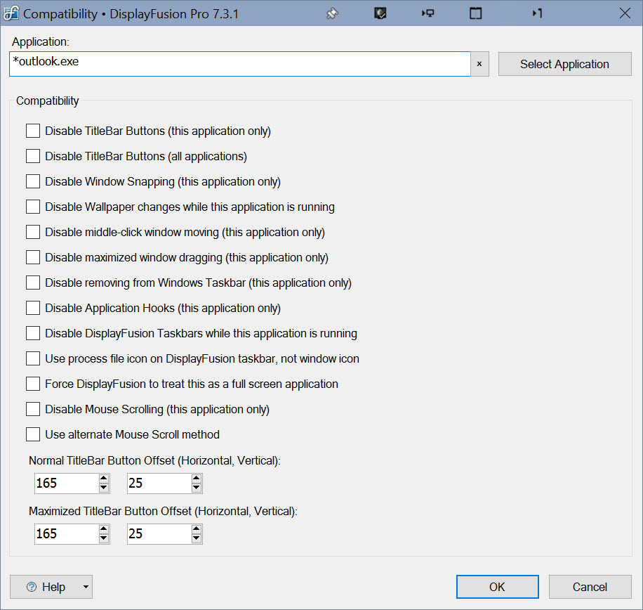
Ah thanks! I was looking at an Excel 2016 window, and there are some office controls in that spot. Looks like that spot is indeed empty in Outlook 2016 though. Can you attach a screenshot of your Compatibility rule? I just created one like the attached, and was able to position the buttons where you indicated in your screenshot.

Outlook2016Compatibility.jpg

Robert G Crockett
5 discussion posts
I am also having this problem. I tried to apply the compatibility settings that you have suggested, but that results in the button completely disappearing. Thanks.
@Robert: You might need to play with the values in the Compatibility rule a bit. I'd start with just doing something like -50, 0, and then tweak from there.

NetMage
302 discussion posts
I just tried with Office Pro Plus 2016 and see the same compatibility issue - vertical offsets trying to move the title bar buttons off the top of the window edge down to match the Outlook 2016 buttons don't work. When I click apply the buttons blink off then redraw in the same location.
The offsets seem to work fine when not maximized, so I created a custom function to resize to 100%x100% instead of maximizing Office 2016 for now.
They also look terrible with the blue titlebar/white buttons that Outlook is using on my system.
Oct 16, 2015 (modified Oct 16, 2015)
•
#7
Keith, Sorry I wasn't back recently to follow up, but it looks like some others have chimed in and found a similar issue and your team has it on their radar. I'm always impressed with the responsiveness of BinaryFortress. Thanks!
Oct 22, 2015 (modified Oct 22, 2015)
•
#9
No worries, thanks for the kind words!

NetMage
302 discussion posts
The new version seems to work well with maximized Outlook 2016, but I wish I could change the button set for one that matches the Windows 10 blue/white icons I have (perhaps just a button set without gray?).
I also notice the DF buttons don't fade when a window loses focus the way the stock buttons do.
Jun 10, 2016 (modified Jun 10, 2016)
•
#12
Excellent! I've put those two suggestions on the list.
Thanks!