sfwrtr
273 discussion posts
[size=1](XP SP2 3.6GHZ 4GB v3.0.102)[/size]
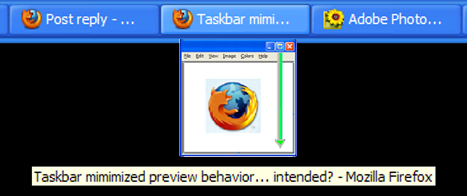
Sometimes instead of a task bar preview, I see a strange icon. See picture. As best as I can gather, this symbol appears only when the window is minimized.
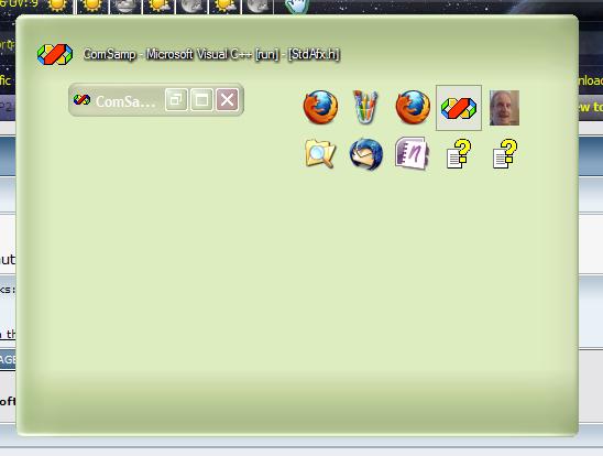
Is this behavior intentional? If so, I would suggest you take a cue from Windows XP that shows a preview of a minimized caption bar in this situation. See picture. You could also cache previews, I suppose, but that could eat up a lot of RAM...

mimimizedPreview.JPG

XPpowerToyAltTabPreview.JPG
It's true, it shows up when the window is minimized. I thought about showing what I can get (like the minimized caption bar) but I thought it didn't really add any value. However, in both Windows Vista and Windows 7 when using Aero (DWM) it does show the window preview even when minimized. I also thought about saving screenshots of the windows, but that would add an extreme amount of CPU and memory overhead for very little benefit.

sfwrtr
273 discussion posts
I understand now what the program is telling me, but the point is that I didn't get it until I started gathering information to post to you. When I tried to figure out how to reproduce the behavior, it was then that it suddenly occurred to me the icon meant "minimized, no data." Possibly, I'm being a bit dense. That said, the window with an arrow in it looks like an icon used in other places to mean download. I was probably also a bit confused.
Thinking about it, your icon is a request to restore the window. This is probably why MS shows a Window caption bar in their preview software. I was thinking that maybe you could use a graphic showing the mouse clicking a restore or a minimize icon, but since neither are visible per se when a window is minimized (they're in the context menu), that probably won't work. You could just state in the preview "Minimized - No Data" (simple, straightforward), but then there would be localization issues.... I guess it comes down to this: if you are displaying previews, perhaps you should be displaying a preview... not an icon; which is to say, a preview of a minimized window. As hard as it is to accept, maybe MS got this right? Dunno. I am not an MS fan, so don't get me wrong here. I think you are adding behaviors that MS should have had from the beginning, and doing it well. So, how you do this is ultimately an ascetic issue and up to you to decide. (My 2 cents.)

Kevin F.
456 discussion posts
Why not just the icon of the program? Maybe superimpose that arrow.

sfwrtr
273 discussion posts
@pyrobob @Jon
Or you could put the 16x16 icon in the caption bar of a window that suggests clicking the restore button...?

Kevin F.
456 discussion posts
Nice thinking with the smaller icon issue, looks good so far!

sfwrtr
273 discussion posts
Please excuse me for being nitpicky - I mean no disrespect - but the short green arrow still screams download to me. What about doubling the size of the icon, making the green arrow extend from the then visible restore button to the bottom? Something like the image attached below...? I added a bit of yellow to the restore button to brighten it.

RestoreMe.JPG

RestoreMeContext.jpg

benway
343 discussion posts
Can I ask what the green arrow is doing there in the first place? Seems kind of obvious to me it's a preview of the program in question without a strange arrow in there.