Lum
42 discussion posts
This screenshot shows the stock Win10 taskbar next to the DF one. There's quite a few annoying bugs with the DF one.
Firstly DF doesn't honour the "use small icons" taskbar setting properly, as it's still using the large icon for the start menu.
The clock area appears to be limited to the width of the systray (or possibly just has big margins) meaning that the text gets messed up. On Win7 this is dealt with slightly more gracefully by shrinking the font size, though the result is still ugly. This only happenned on Win7 after a recent upgrade (can't remember which 8.x version it was, but it definitely didn't happen on 7.x), no idea if it was ok on Win10 previously.
The task view button is missing
Pidgin has the wrong icon. It's supposed to just display the main Pidgin icon, but instead the icon of one of the chat windows is showing up as the main icon.
The colour of the taskbar is wrong.
It should probably be noted that I have modified the stock windows taskbar a little. I'm using 7+ Taskbar Tweaker to reduce the minimum width to 34px and remove the show desktop button, which is also what the DF taskbar is set to via the settings. I've also used TClock Redux to change the stock taskbar clock text to the more concise format shown, and use the advanced settings in DF to replicate the change, but this shouldn't affect how DF works. DF lets you set a 34px taskbar and custom clock text without hacking anything, and the small start button is a stock Windows setting, not a third party hack.

DFGlitches.png

Lum
42 discussion posts
Done a bit more digging on this.
This is on Win7.
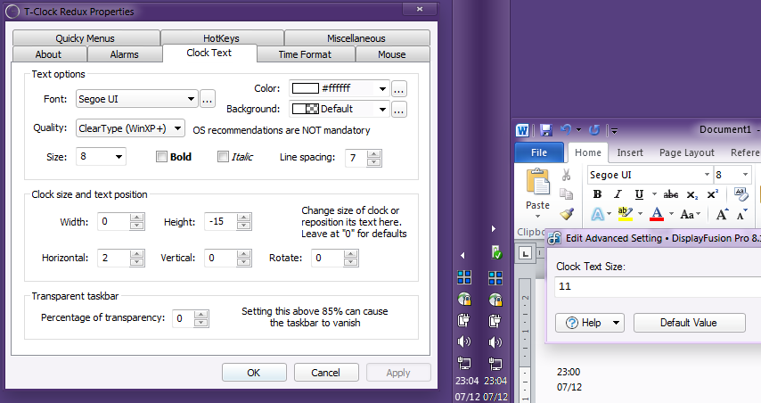
The left hand taskbar is a 34px wide OS taskbar with T-Clock redux set to 9pt Segoe UI.
The right hand one is a 34px wide DF taskbar with the text size set to 11 (if I set it to 12, I get ellipses)
What's immediately obvious to me is that the DF taskbar is using a different font sizing scheme, and being more aggressive with the ellipses. If I set T-Clock to 8pt then they match.
For bonus points can you add the ability to specify the font and also the line spacing? The big gap looks a bit daft, and I quite like dropping it to 2 or 3 px in T-Clock, but then DF doesn't match.
Edit: Added a second shot, showing the settings, and also MS Word showing the same font&size to show that DF is doing something wrong with the specified font size. It also shows that T-Clock is using a much nicer font rendering method than DF, which seems to be contributing to the feeling of not matching.

DFClockGlitch.png

DFClockGlitch2.png
Dec 7, 2016 (modified Dec 7, 2016)
•
#4

Lum
42 discussion posts
And some Win10 digging. The advanced option TaskbarsNoExternalStartButtonData fixes the start button glitch, implying that something is going wrong with grabbing the start button from StartIsBack when small icons are set and StartIsBack is set to use the stock icon from your theme.
The same font size inconsisentcies are present in Win10, but for some reason it's even more agressive with the ellipses, so even size 8/11 doesn't work. Fortunately on this machine I've decided to put the Time Zone name rather than the date on that side.
It seems that DF is grabbing the max height of the clock from the OS taskbar, which it probably shouldn't be doing when a vertical taskbar is in use and the DF clock may contain different information. I can influence the height of the DF clockby changing the height in TClock and then restarting DF, and this is necessary if I want to get more lines of text in there. Again advanced settings to override the width and height might be nice, but in the meantime, by ensuring that DF is started before TClock I can resolve some of the glitches, just not the width!
Dec 7, 2016 (modified Dec 7, 2016)
•
#5

Lum
42 discussion posts
It gets weirder. The clipping issue on the clock didn't appear on a fresh DF install on a new machine, until I manually set the size of the taskbar from the menu. Setting the size back to automatic didn't clear it and neither did wiping the Taskbars folder from DF's registry settings, so I have no idea what is going on there!