cobrabr
23 discussion posts
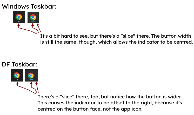
In a nutshell, DF uses a different approach than Windows does when adding the visual indicator that multiple windows are grouped under the same button (which makes it look like overlapped buttons) on its taskbars: Windows "slices" the button but keeps its width, while DF widens it.
This wouldn't be a problem if not for the fact that it causes the "running" indicator (the line the shows up underneath the app's icon when it's open) shows off-centre on the DF taskbars. The image I attached should clarify what I mean.
Life is like a baboon's ass: colourful and full of shit...

screenshots.png
Jul 20, 2023 (modified Jul 20, 2023)
•
#1
I was able to reproduce that here so I've added it to our list to look into.
Thanks!